AuthorWrite something about yourself. No need to be fancy, just an overview. Archives
December 2019
Categories |
Back to Blog
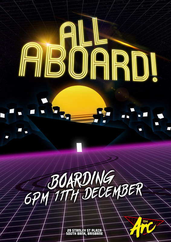
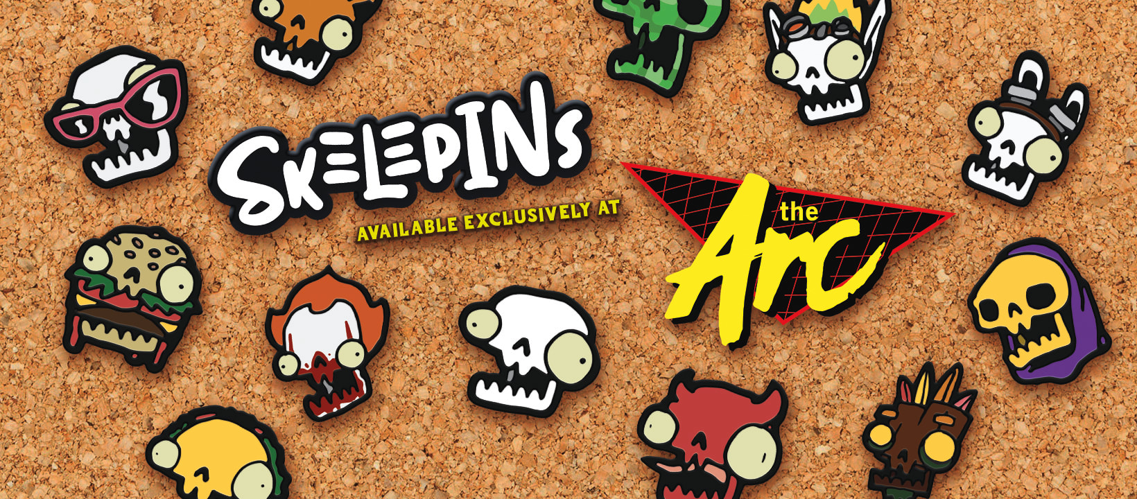
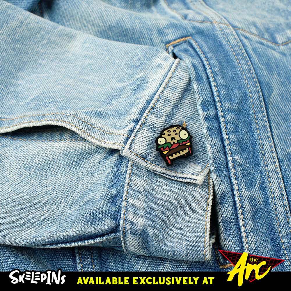
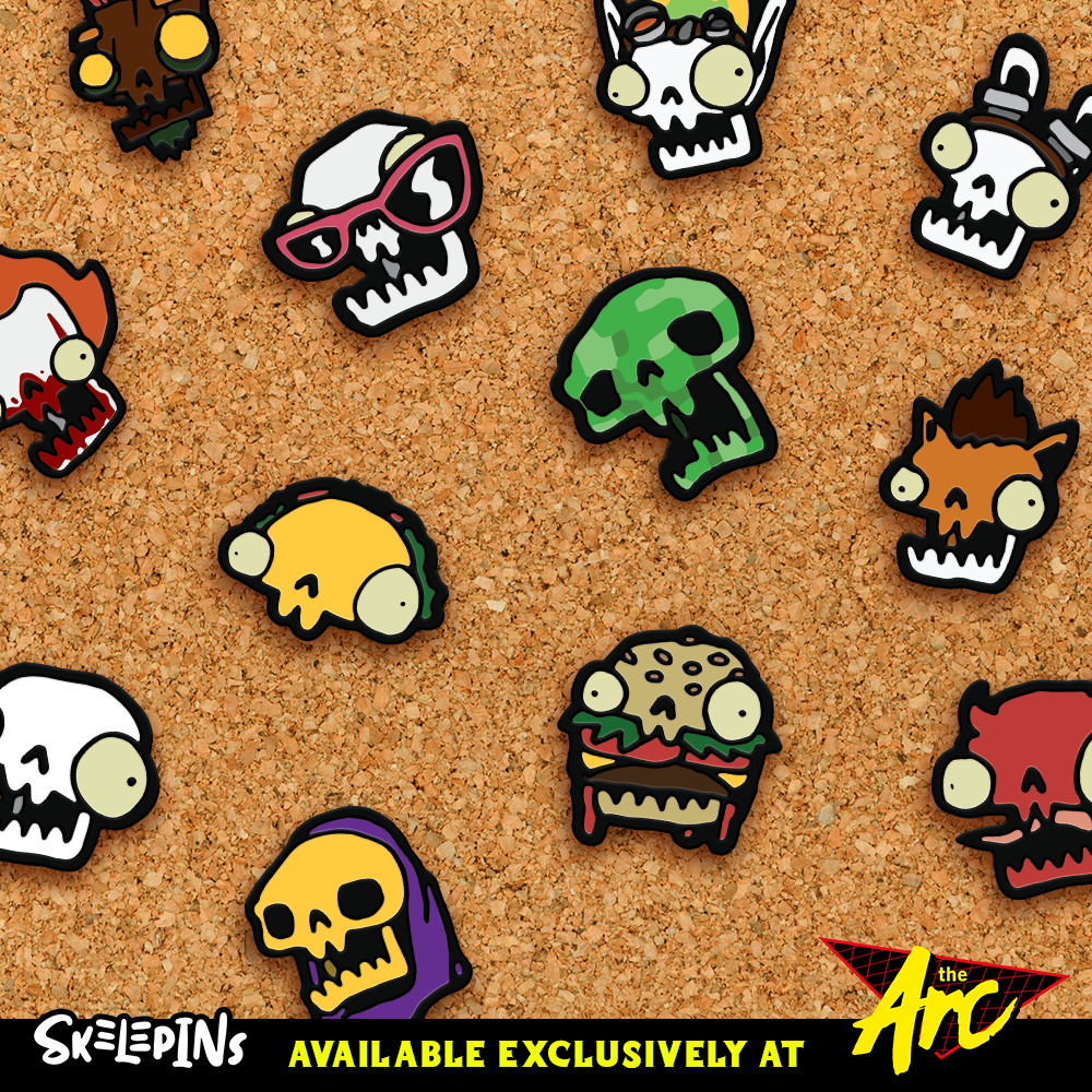
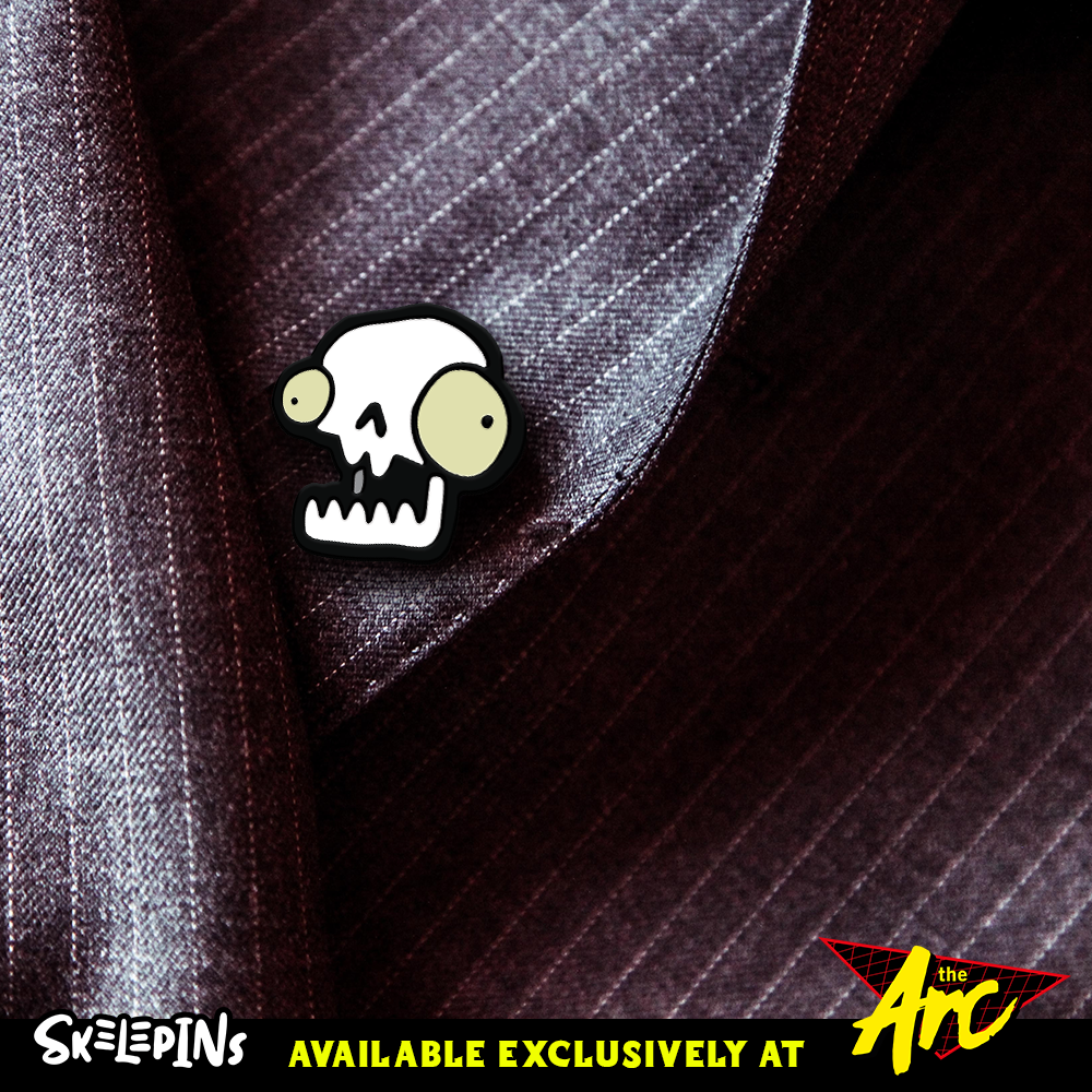
Finale13/12/2019 2019. What a hell of a year. This trimester has been a difficult one for me to process as within the first month, I had to isolate myself to get back to being me. This was, without a doubt, the main reason that my ideation at the start of the trimester had taken a hit. I wasn't myself, and thus, my project was not the best it could have been. That is, until I picked up a pen and started drawing skeleton pins... This trimester I took the idea of a barcade and tried to take it out of The Valley. In order to do this, I developed an 80's Neon inspired barcade venue in South Bank, Brisbane. The logo above is hand lettered by myself and I am satisfied with the information that it conveys. The Arc is short for The Arcade. The Arc poster I am happy with, but not overly joyed with it. It is missing something, and I just can't focus on what it could be. I added the arcade machines, but now it just looks too busy. I admit this isn't my best work. This is due to the lack of enthusiasm I had attached to this company as once I started drawing the skeleton pins, I made a huge mistake. This is somewhat due to the limiting nature of the theme and era of design that I tried to replicate. The 80's are great in theory... but I feel that this poster is lacking something substantial. As Cathy mentioned, All Aboard! is a pretty big call to action... yet there doesn't appear to be any action to be called to. Cannot upload my video here as my website provider is asking for payment to upload a video. https://drive.google.com/open?id=1sObsDjbRrx2jgv8BNVR1yDMawqxsyFQF I don't think I showed these versions during my final presentation on Monday or at Synergy, but they are all specialty printed in different ways. The Orange / Level 1 card has no specialty printing, except for the UV gloss on the magnetic strip on the back. The White / Level 2 card has UV gloss on the black items on the front and the magnetic strip on the back. Finally, the Black / Level 3 card has a UV gloss magnetic strip on the back and gold foiling on the yellow items on the front. I feel like these turned out really well and look forward to developing these skills further in the future as these turned out really well after taking on the feedback that was provided during the walkthrough feedback session recently. As we came closer to the end of the trimester, my mind was swaying back and forth and wasn't able to settle on a single idea. I knew I wanted to make collectible pins for The Arc, so I began ideating by drawing. A lot. As I was designing up some "exclusive" pins for The Arc and then I had my Eureka moment! I drew a cartoon skeleton head and it was all uphill from there. I developed a total of 86 pin designs. 70 of those being skeleton heads as different pop culture characters from tv shows, movies and video games. This is when I knew that I had hit my mark. For the development of this assessment, and so I don't reveal all of them before they go public, I decided to select 12+1 hidden pin to make the scope of this assessment a little more achievable considering how late in the trimester this moment struck. During a tutorial, a peer suggested to put the pins onto a cork board to present them for Synergy. As funds are tight at the moment on my end, I decided to promote these pins in collaboration with The Arc to justify their place in my assessment. As they are a collectible pin, I made them an exclusive pin set that would be available ONLY at The Arc. As mentioned during my Final Presentation, this is really where my skills as an illustrator and designer really got to shine. I took this idea further and developed 3 social media posts for the brand. With the successful designs of these pins, I was able to rework my existing collectible pin box and I am more than happy with the result. These pin boxes, while amazing in design, are slightly flawed as I discovered on Synergy night. As there was only one piece holding the box from opening up, people were able to remove the mystery element of the pin boxes by slightly bending the carton to see what was inside. A minor issue, but they were intended to be in sealed black bags to prevent that. I learned throughout this trimester to be more confident in what my heart desires, to stop being so critical about myself, and to not punish myself for not hitting my stride from the get go. This is the first trimester where I actually felt challenged more than most, and it shows. I will improve on this as next trimester I only have Final Project to complete and then my degree will be complete. I'm excited and the extra time that has just freed up, will allow me to focus on the product that I have wanted to produce for a while now. One of my external clients this trimester was The Wheel of Brisbane. They requested a fun and vibrant magnet that appealed to a young tourist audience. The quality of the design that I have produced is high and the feedback that I received was only positive. My second external client was Heidi Matthee. Heidi requested a fun, yet professional business card to hand out at networking events to build her client base for creative and innovation solutions. As per her requests, I utilized the colours she suggested; pastel purple and green. I am happy with the result of this design. However, this was designed during the back end of two weeks off due to personal medical reasons and the result is not as great as I was hoping for. As my personal issues have become manageable, this should not arise in the future. Witchy Brew was my interdisciplinary project with Cypress Reeves, a potion brewing herbalism app. As mentioned in my previous blog, the online communication was a little lack-luster by the end as I was led to believe through a mix of unrealistic time-frames, that I had 48 hours to produce 62 images of plants. Despite this confusion, which was clarified after a few hours, I was able to produce the 24 that it was reduced down to. Cypress was impressed with the quality of work in the short amount of time allotted to complete the remainder of the designs. In future, I will be opting for a better communication method as messages can easily go unseen and left for over a week. This trimester I tackled the challenge of re-branding my pre-existing online image, whilst maintaining the same sarcastic, fun, yet professional voice. My existing branding is Brady Larson Art and I was given the task to re-brand as opposed to self-brand. Welcome to Larson Designs. I have accepted fate. I know I have a red-haired beard and instead of maintaining my old glyph, I decided to update it. This is the new glyph and was hand-drawn just like the Skelepins were. The drawing was scanned in and vectored to what you see before you. I am incredibly happy with the updated glyph of me. Here we have the updated business card for my re-brand. The white logo on the back is UV glossed, and the blue R is also UV glossed. The details on the face of the card are inacurate and represent the hypothetical brand Larson Designs. As my hosting fees are still coming out until next August, I changed these details during Synergy to provide potential clients my current details. This is evident in the InDesign files located on the Google Drive. This promotional packaging is used to hand out a small stack of 40 premium business cards provided by Larson Designs. This little box design does not need any glue or tape to assemble. This is purely a foldable box. I feel like this design worked really well as, per my feedback, the viewing window at the top shows customers what they're getting. Here we have the Facebook cover banner and the profile picture, which also doubles as one of my social media posts showing that my re-brand is now live. This has already gone into effect on Instagram @larsondesigns94 Overall, I am quite happy with the quality of the work that I have designed this trimester. Even though I have identified the few areas which slipped up this trimester, I have made up for them tenfold by putting a vast majority of time and effort into perfecting the Skelepins and with the recent positive influx of feedback from Synergy, I will be producing those over the break. Time to break out into the real world and start doing instead of thinking. With The Arc, I have learned not to stress myself out as much as I did over an idea, and if that happens, idiate more until I reach the place I did with Skelepins. In saying that, I have learned that if I really want to do something, then just go for it. Constantly I second guess myself about whether I should be doing something or not. In this case, I should have pivoted earlier towards the pins. This would have allowed for more time to produce them and get even more for Synergy. 31 pins was definitely not enough. Gone within the first hour. In terms of collaboration work, the two weeks that I had off were out of my hands. That being said, I was granted an extension, but was too stubborn to take the extra time and refine the content for Heidi's cards. The Wheel of Brisbane however... Get those to print. I love those and have learned that real world clients struggle to get back to you as much as I remember they did before I returned to SAE. Now, Collaboration... What have I learned? I learned that if I am to take on another games design student for a collaboration, I will be making sure that they iron out EVERYTHING that they want and when by. Too often were multiple choice questions asked and a "yes" was a response... In the future I will be making sure to take my time to go through exactly they want until I get a straight answer... Larson Designs, which I wanted to call Larshole Designs... I feel that this branding suits my personality nicely. I am fun and sarcastic, yet professional. My glyph and identity graphic are fun and somewhat tongue in cheek with the acceptance of my red beard and the flat sticker style illustration. Whereas the typographical identity is strictly professional without distancing myself too far from my existing logo - which also had a solid O in Larson. I feel like I deserve a distinction for this trimesters work. Even though my time management and personal issues have been lackluster this trimester, I was still able to perform to the best of my ability and produce a high quality body of work within the allotted time. In 2020, I will be more dedicated and focused on my future as I am now 25... I'm not getting any younger. The competition in the industry is incredibly vicious and I am hungry. I'm ready to show the world what I've got. Final project... here I come. References for Images used in Design work
The Arc Background of VIP Cards Abstract Grey Geometric Polygon Background. (2019). [Image]. Retrieved from https://www.vecteezy.com/vector-art/256154-abstract-grey-geometric-polygon-background Lens Flares Digital Lens flares Pack 2. (2019). Retrieved 13 December 2019, from https://www.deviantart.com/gfxcave/art/Digital-Lens-flares-pk2-252517463 Star Sky Night Sky Wallpaper. (2019). [Image]. Retrieved from https://www.larutadelsorigens.cat/wallpaper/hxmxR_wallpaper-stars-galaxy-milky-way-starry-sky-night/ Skelepins Denim Jacket Gucci Denim Jacket. (2019). [Image]. Retrieved from https://www.google.com/imgres?imgurl=https%3A%2F%2Fmedia.endclothing.com%2Fmedia%2Ff_auto%2Cq_auto%3Aeco%2Fprodmedia%2Fmedia%2Fcatalog%2Fproduct%2F0%2F5%2F05-12-2019_gucci_nauticallogopocketdenimjacket_blue_594850-xdax0-4206_aj_2.jpg&imgrefurl=https%3A%2F%2Fwww.endclothing.com%2Fgucci-nautical-logo-pocket-denim-jacket-594850-xdax0-4206.html&docid=eDDP5YCDXxdpQM&tbnid=Ri1SNgKp9HDjwM%3A&vet=10ahUKEwiC8vm28LLmAhVl6XMBHTx1D-wQMwgsKAAwAA..i&w=1000&h=1000&itg=1&hl=en-AU&bih=969&biw=1920&q=pocket&ved=0ahUKEwiC8vm28LLmAhVl6XMBHTx1D-wQMwgsKAAwAA&iact=mrc&uact=8 Leather Jacket Leather Purple Suit. (2019). [Image]. Retrieved from https://pxhere.com/en/photo/1096260 Cork Board Cork Board. (2019). [Image]. Retrieved from https://pxhere.com/en/photo/1141010
0 Comments
Read More
Leave a Reply. |
 RSS Feed
