AuthorWrite something about yourself. No need to be fancy, just an overview. Archives
December 2019
Categories |
Back to Blog
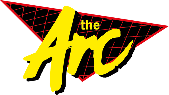
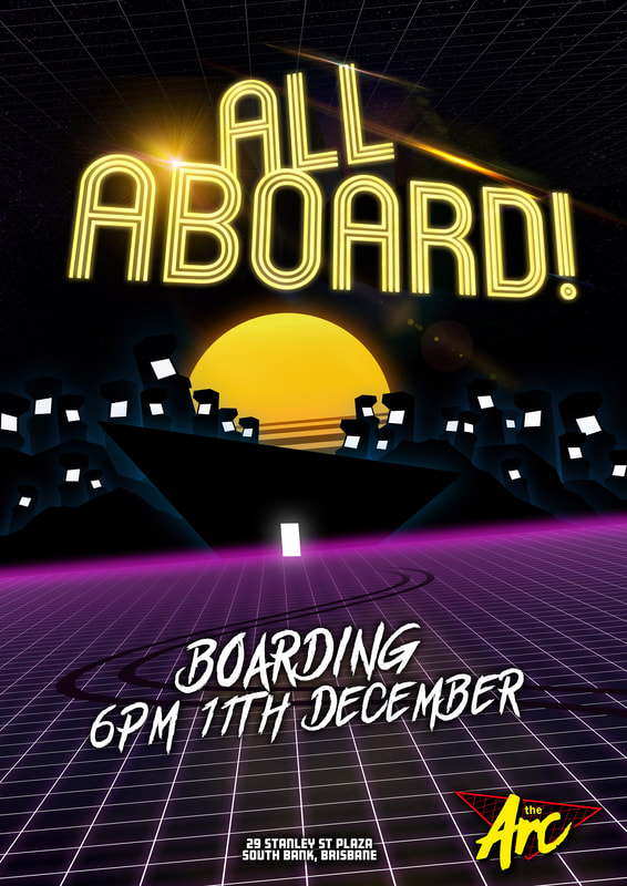
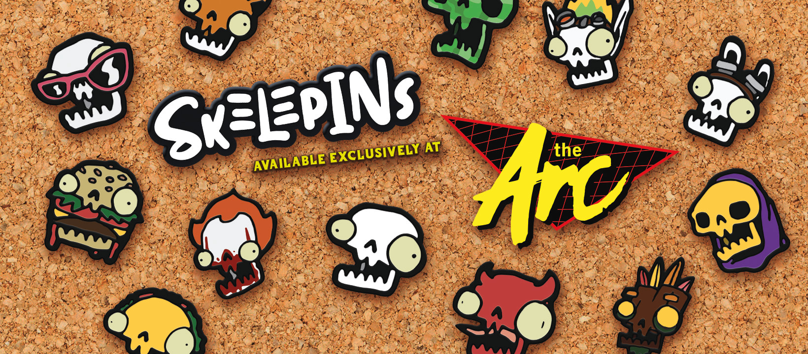
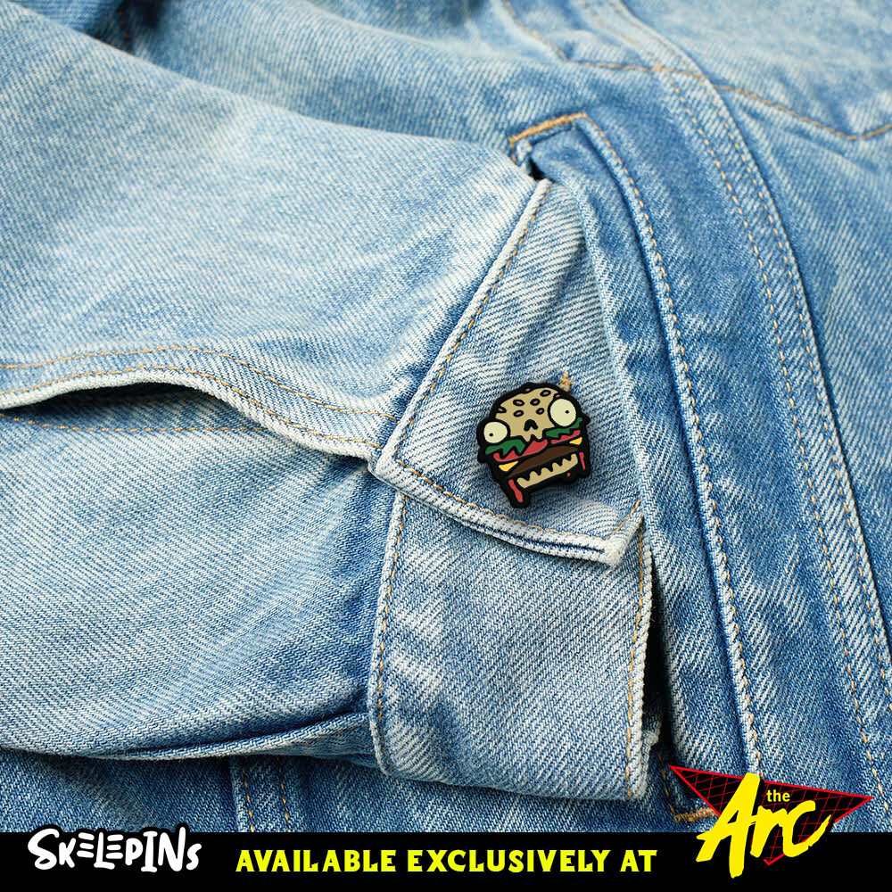
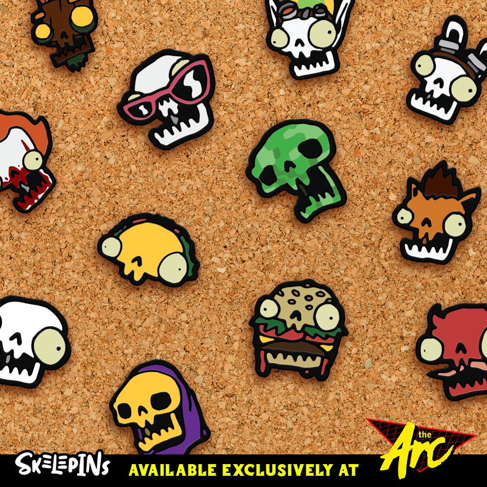
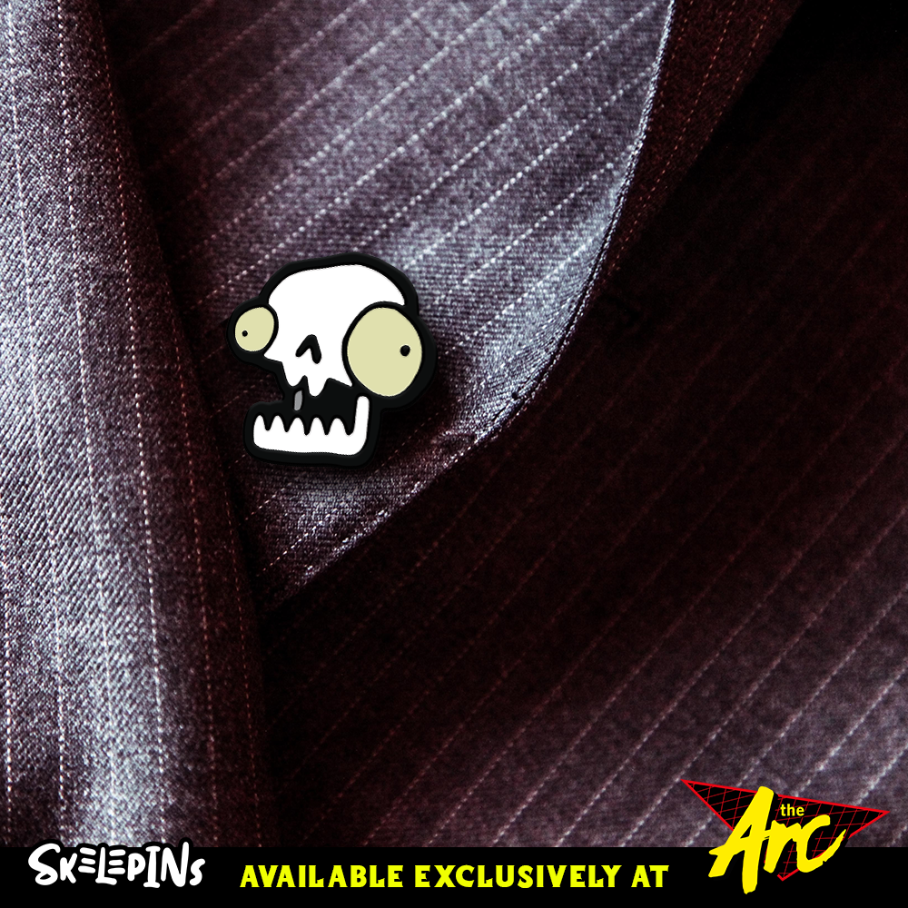
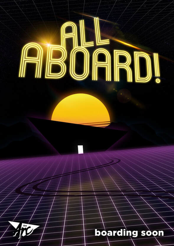
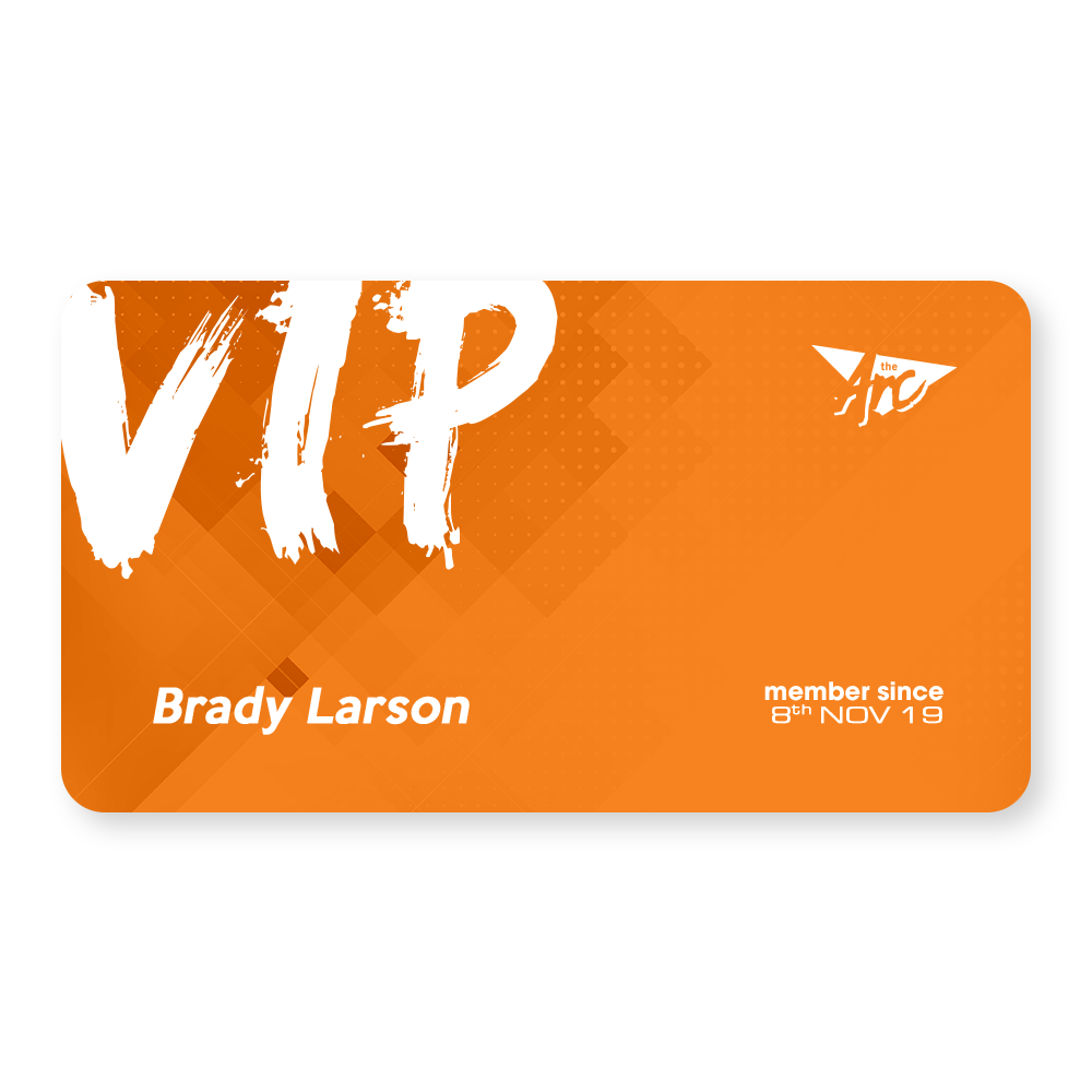
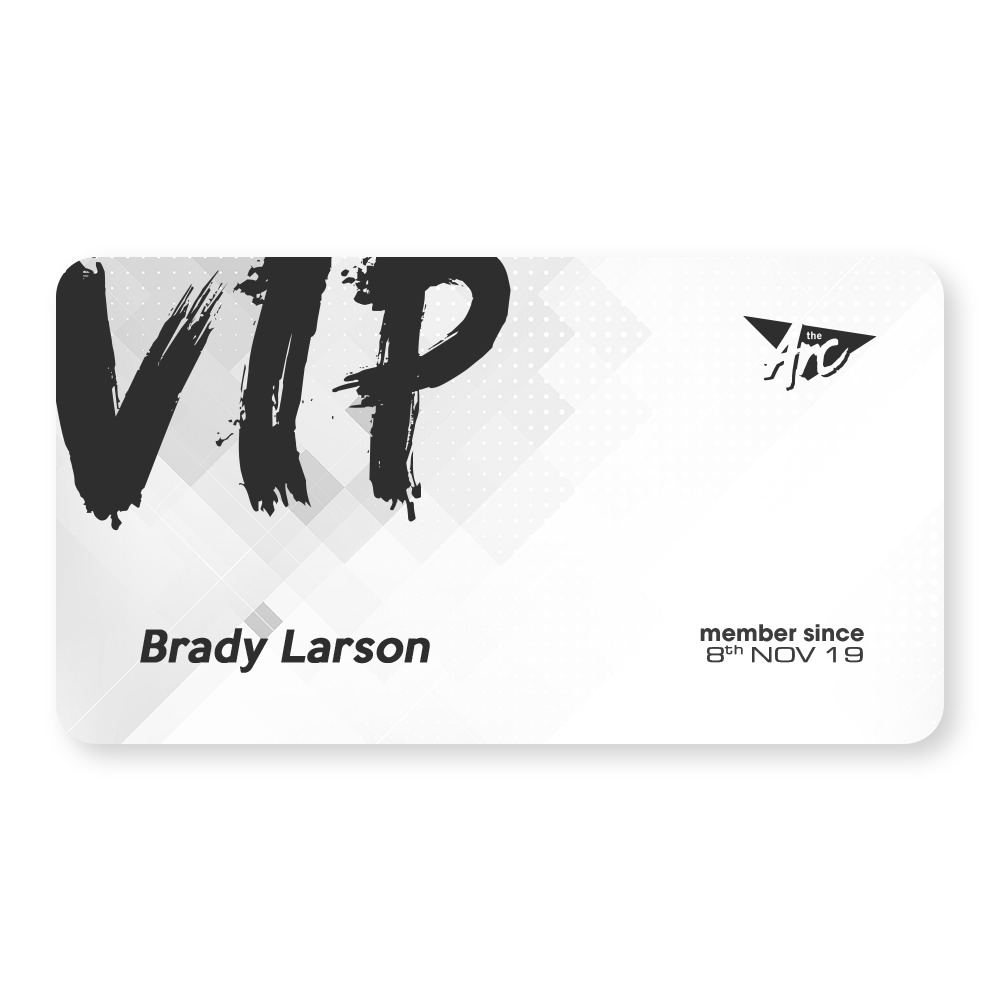
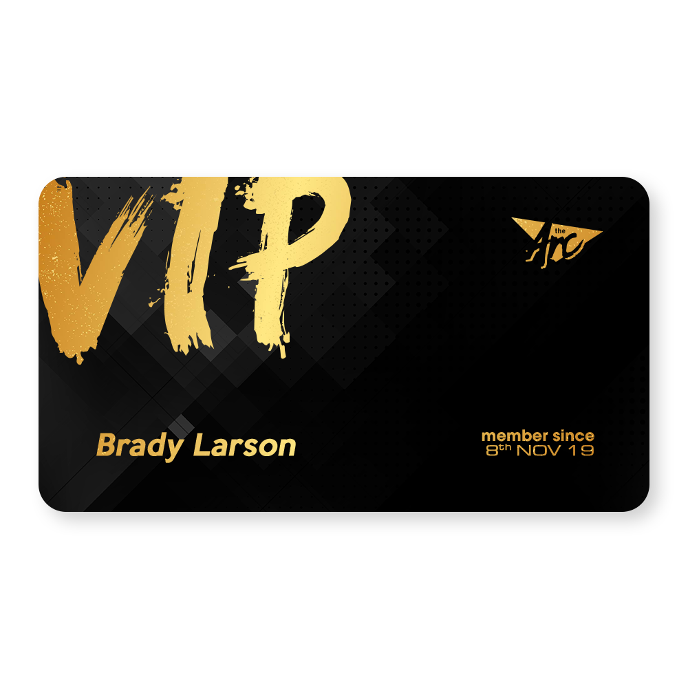
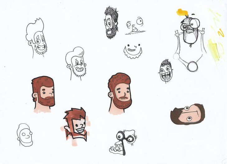
Finale13/12/2019 2019. What a hell of a year. This trimester has been a difficult one for me to process as within the first month, I had to isolate myself to get back to being me. This was, without a doubt, the main reason that my ideation at the start of the trimester had taken a hit. I wasn't myself, and thus, my project was not the best it could have been. That is, until I picked up a pen and started drawing skeleton pins... This trimester I took the idea of a barcade and tried to take it out of The Valley. In order to do this, I developed an 80's Neon inspired barcade venue in South Bank, Brisbane. The logo above is hand lettered by myself and I am satisfied with the information that it conveys. The Arc is short for The Arcade. The Arc poster I am happy with, but not overly joyed with it. It is missing something, and I just can't focus on what it could be. I added the arcade machines, but now it just looks too busy. I admit this isn't my best work. This is due to the lack of enthusiasm I had attached to this company as once I started drawing the skeleton pins, I made a huge mistake. This is somewhat due to the limiting nature of the theme and era of design that I tried to replicate. The 80's are great in theory... but I feel that this poster is lacking something substantial. As Cathy mentioned, All Aboard! is a pretty big call to action... yet there doesn't appear to be any action to be called to. Cannot upload my video here as my website provider is asking for payment to upload a video. https://drive.google.com/open?id=1sObsDjbRrx2jgv8BNVR1yDMawqxsyFQF I don't think I showed these versions during my final presentation on Monday or at Synergy, but they are all specialty printed in different ways. The Orange / Level 1 card has no specialty printing, except for the UV gloss on the magnetic strip on the back. The White / Level 2 card has UV gloss on the black items on the front and the magnetic strip on the back. Finally, the Black / Level 3 card has a UV gloss magnetic strip on the back and gold foiling on the yellow items on the front. I feel like these turned out really well and look forward to developing these skills further in the future as these turned out really well after taking on the feedback that was provided during the walkthrough feedback session recently. As we came closer to the end of the trimester, my mind was swaying back and forth and wasn't able to settle on a single idea. I knew I wanted to make collectible pins for The Arc, so I began ideating by drawing. A lot. As I was designing up some "exclusive" pins for The Arc and then I had my Eureka moment! I drew a cartoon skeleton head and it was all uphill from there. I developed a total of 86 pin designs. 70 of those being skeleton heads as different pop culture characters from tv shows, movies and video games. This is when I knew that I had hit my mark. For the development of this assessment, and so I don't reveal all of them before they go public, I decided to select 12+1 hidden pin to make the scope of this assessment a little more achievable considering how late in the trimester this moment struck. During a tutorial, a peer suggested to put the pins onto a cork board to present them for Synergy. As funds are tight at the moment on my end, I decided to promote these pins in collaboration with The Arc to justify their place in my assessment. As they are a collectible pin, I made them an exclusive pin set that would be available ONLY at The Arc. As mentioned during my Final Presentation, this is really where my skills as an illustrator and designer really got to shine. I took this idea further and developed 3 social media posts for the brand. With the successful designs of these pins, I was able to rework my existing collectible pin box and I am more than happy with the result. These pin boxes, while amazing in design, are slightly flawed as I discovered on Synergy night. As there was only one piece holding the box from opening up, people were able to remove the mystery element of the pin boxes by slightly bending the carton to see what was inside. A minor issue, but they were intended to be in sealed black bags to prevent that. I learned throughout this trimester to be more confident in what my heart desires, to stop being so critical about myself, and to not punish myself for not hitting my stride from the get go. This is the first trimester where I actually felt challenged more than most, and it shows. I will improve on this as next trimester I only have Final Project to complete and then my degree will be complete. I'm excited and the extra time that has just freed up, will allow me to focus on the product that I have wanted to produce for a while now. One of my external clients this trimester was The Wheel of Brisbane. They requested a fun and vibrant magnet that appealed to a young tourist audience. The quality of the design that I have produced is high and the feedback that I received was only positive. My second external client was Heidi Matthee. Heidi requested a fun, yet professional business card to hand out at networking events to build her client base for creative and innovation solutions. As per her requests, I utilized the colours she suggested; pastel purple and green. I am happy with the result of this design. However, this was designed during the back end of two weeks off due to personal medical reasons and the result is not as great as I was hoping for. As my personal issues have become manageable, this should not arise in the future. Witchy Brew was my interdisciplinary project with Cypress Reeves, a potion brewing herbalism app. As mentioned in my previous blog, the online communication was a little lack-luster by the end as I was led to believe through a mix of unrealistic time-frames, that I had 48 hours to produce 62 images of plants. Despite this confusion, which was clarified after a few hours, I was able to produce the 24 that it was reduced down to. Cypress was impressed with the quality of work in the short amount of time allotted to complete the remainder of the designs. In future, I will be opting for a better communication method as messages can easily go unseen and left for over a week. This trimester I tackled the challenge of re-branding my pre-existing online image, whilst maintaining the same sarcastic, fun, yet professional voice. My existing branding is Brady Larson Art and I was given the task to re-brand as opposed to self-brand. Welcome to Larson Designs. I have accepted fate. I know I have a red-haired beard and instead of maintaining my old glyph, I decided to update it. This is the new glyph and was hand-drawn just like the Skelepins were. The drawing was scanned in and vectored to what you see before you. I am incredibly happy with the updated glyph of me. Here we have the updated business card for my re-brand. The white logo on the back is UV glossed, and the blue R is also UV glossed. The details on the face of the card are inacurate and represent the hypothetical brand Larson Designs. As my hosting fees are still coming out until next August, I changed these details during Synergy to provide potential clients my current details. This is evident in the InDesign files located on the Google Drive. This promotional packaging is used to hand out a small stack of 40 premium business cards provided by Larson Designs. This little box design does not need any glue or tape to assemble. This is purely a foldable box. I feel like this design worked really well as, per my feedback, the viewing window at the top shows customers what they're getting. Here we have the Facebook cover banner and the profile picture, which also doubles as one of my social media posts showing that my re-brand is now live. This has already gone into effect on Instagram @larsondesigns94 Overall, I am quite happy with the quality of the work that I have designed this trimester. Even though I have identified the few areas which slipped up this trimester, I have made up for them tenfold by putting a vast majority of time and effort into perfecting the Skelepins and with the recent positive influx of feedback from Synergy, I will be producing those over the break. Time to break out into the real world and start doing instead of thinking. With The Arc, I have learned not to stress myself out as much as I did over an idea, and if that happens, idiate more until I reach the place I did with Skelepins. In saying that, I have learned that if I really want to do something, then just go for it. Constantly I second guess myself about whether I should be doing something or not. In this case, I should have pivoted earlier towards the pins. This would have allowed for more time to produce them and get even more for Synergy. 31 pins was definitely not enough. Gone within the first hour. In terms of collaboration work, the two weeks that I had off were out of my hands. That being said, I was granted an extension, but was too stubborn to take the extra time and refine the content for Heidi's cards. The Wheel of Brisbane however... Get those to print. I love those and have learned that real world clients struggle to get back to you as much as I remember they did before I returned to SAE. Now, Collaboration... What have I learned? I learned that if I am to take on another games design student for a collaboration, I will be making sure that they iron out EVERYTHING that they want and when by. Too often were multiple choice questions asked and a "yes" was a response... In the future I will be making sure to take my time to go through exactly they want until I get a straight answer... Larson Designs, which I wanted to call Larshole Designs... I feel that this branding suits my personality nicely. I am fun and sarcastic, yet professional. My glyph and identity graphic are fun and somewhat tongue in cheek with the acceptance of my red beard and the flat sticker style illustration. Whereas the typographical identity is strictly professional without distancing myself too far from my existing logo - which also had a solid O in Larson. I feel like I deserve a distinction for this trimesters work. Even though my time management and personal issues have been lackluster this trimester, I was still able to perform to the best of my ability and produce a high quality body of work within the allotted time. In 2020, I will be more dedicated and focused on my future as I am now 25... I'm not getting any younger. The competition in the industry is incredibly vicious and I am hungry. I'm ready to show the world what I've got. Final project... here I come. References for Images used in Design work
The Arc Background of VIP Cards Abstract Grey Geometric Polygon Background. (2019). [Image]. Retrieved from https://www.vecteezy.com/vector-art/256154-abstract-grey-geometric-polygon-background Lens Flares Digital Lens flares Pack 2. (2019). Retrieved 13 December 2019, from https://www.deviantart.com/gfxcave/art/Digital-Lens-flares-pk2-252517463 Star Sky Night Sky Wallpaper. (2019). [Image]. Retrieved from https://www.larutadelsorigens.cat/wallpaper/hxmxR_wallpaper-stars-galaxy-milky-way-starry-sky-night/ Skelepins Denim Jacket Gucci Denim Jacket. (2019). [Image]. Retrieved from https://www.google.com/imgres?imgurl=https%3A%2F%2Fmedia.endclothing.com%2Fmedia%2Ff_auto%2Cq_auto%3Aeco%2Fprodmedia%2Fmedia%2Fcatalog%2Fproduct%2F0%2F5%2F05-12-2019_gucci_nauticallogopocketdenimjacket_blue_594850-xdax0-4206_aj_2.jpg&imgrefurl=https%3A%2F%2Fwww.endclothing.com%2Fgucci-nautical-logo-pocket-denim-jacket-594850-xdax0-4206.html&docid=eDDP5YCDXxdpQM&tbnid=Ri1SNgKp9HDjwM%3A&vet=10ahUKEwiC8vm28LLmAhVl6XMBHTx1D-wQMwgsKAAwAA..i&w=1000&h=1000&itg=1&hl=en-AU&bih=969&biw=1920&q=pocket&ved=0ahUKEwiC8vm28LLmAhVl6XMBHTx1D-wQMwgsKAAwAA&iact=mrc&uact=8 Leather Jacket Leather Purple Suit. (2019). [Image]. Retrieved from https://pxhere.com/en/photo/1096260 Cork Board Cork Board. (2019). [Image]. Retrieved from https://pxhere.com/en/photo/1141010
0 Comments
Read More
Back to Blog
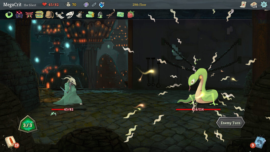
Whichy Breway Is Up?7/12/2019 In order for me to work consistently with Cypress and what he would like to achieve for his mobile app, I took it upon myself to look further into the inspiration that he provided in terms of aesthetic, art styles and alike. Cypress was really drawn towards the art-styles attached to games such as Stardew Valley and Slay the Spire. After sing the image above as a reference, I was able to gain an understanding of what Cypress was after. A series of vector glyphs with a dark outline to highlight the artwork produced. I did a little more digging to find out that Bruce Brenneise is the artist behind the art-style above. Even though a majority of his work is heavily detailed and textured, Slay the Spire maintains a simple, yet charming style throughout. I have produced content similar to this for Cypress. The second point of reference that Cypress directed me towards is Stardew Valley, an indie game was produced by one person; Eric "ConcernedApe" Barone. Despite this title being developed by one person, quality was not compromised. When bringing this game up with me, Cypress expressed how interested he was in regards to the legibility of the icons above. All of the icons are easily identifiable and they're pixel art. Cypress wanted this to be a similar situation for his own game. So it was to be done. Below is a series of the sets of icons and images that I had provided for Cypress. Plants Despite a few hiccups in terms of online communications and a mix of unrealistic time-frames, he was more than happy with the quality of work that I had produced over the course of the trimester. References Slay the Spire Screenshot. (2019). [Image]. Retrieved from https://store.steampowered.com/app/646570/Slay_the_Spire/ Stardew Valley Inventory. (2018). [Image]. Retrieved from https://www.reddit.com/r/StardewValley/comments/8wpj7e/til_you_can_view_community_center_bundles_from/
Back to Blog
Copy, right?5/12/2019 Entering the design world, it is important for myself and my fellow peers to understand the world of copyright in regards to design work. Whilst reviewing the Australian Copyright Council's informational pdf in regards to Graphic Designers and Copyright, I was able to educate myself in regards to what is and isn't covered by copyright under the 1968 Copyright Act. Drawings, logos, photographs and visual images are generally protected by copyright. However, ideas, styles and/or techniques are not. The ownership of copyright changes according to the circumstances in which the work was made. Copyright protects artistic works, musical works, dramatic works, broadcasts, sound recordings, films and published editions. Stylized typographical logos are considered an artistic work, and are protected by copyright to the respective author. Copyright protection is automatic and free. It is applied automatically once you have created the work. There is no formal procedure to apply copyright. However, you can issue said copyright notice by applying the copyright symbol followed by the name of the copyright owner and the year. If works are commissioned by Commonwealth, State or Territory governments, then the work would be owned by the respective government. This does not apply to local governments and are handled the same as commissioned works. If a designer, like myself, is commissioned to create a work, the designer will own copyright, unless agreed to in writing. Finding this out now, I have a few clients I will have to issue a transfer of copyright to... Death of the author + 70 years is when copyright expires. There are exceptions to this, but are not detailed in the pdf. You cannot copyright an idea until it has been written down or expressed in a material form. I knew this already, and it is why I have remained silent about my Final Project plans as I do not want my project stolen. Works of art that have been commissioned by clients will need to discuss with you in order to present them on your own portfolio. There is also no rule that states a percentage of an image found or used where the copyright is owned by someone else is allowed. Despite the information given during a Typography lecture, using a typeface that holds copyright without licence, you may be liable for breach of copyright. Further information can be found at copyright.org.au This information has been incredibly helpful for myself to move forward as a freelance graphic designer entering the world. I have never previously issued a copyright transferal document. I will definitely be applying this practice in the future. References
Graphic Designers & Copyright. (2019). Retrieved 5 December 2019, from http://www.copyright.org.au/ACC_Prod/ACC/Information_Sheets/Graphic_Designers___Copyright.aspx
Back to Blog
The Importance of Feedback3/12/2019 Throughout this trimester it can be, and has been, easy to lose focus on what makes your designs great. Hell, for a majority of the trimester I wasn't a massive fan of my own work. When designing an entire suite of branding items for an upcoming company, it is increasingly important to gather constructive feedback from your peers to determine the best result moving forward. Upon conducting more research for myself into user testing, I was able to identify a few key questions that I had to ask myself, before asking others. Startquestion.com (2016) outlined the importance of customer feedback in any business. They determined that customer feedback helps improve products and services, measure customer satisfaction, shows value of their opinions, helps you create the best customer experience, improve customer retention, gives you data to help making critical business decisions, and works as a reliable source of information to other consumers. Improving products and services is important as it proves if you have to have an understanding of the audience that you are targeting. Professional knowledge is worthless if your customers values aren't your highest priority. Measuring customer satisfaction is a critical factor to build up brand loyalty and is a determination of the companies financial performance. Customer satisfaction and business performance have been proven to be hand-in-hand with each other. Valuing customers opinions makes them feel more involved with the shaping and foundations of the business that you are creating. User testing surveys are a good way to show your customers that you value their opinions, and will be more inclined to recommend your products or services if they feel that they were involved in some way. People will always appreciate you taking the time and effort to see if they are happy (or unhappy) with your services. Creating the best customer experience is made a hell of a lot easier when you focus on providing a brand worth being loyal to. Demonstrate that you value them as customers and purchasing your product will improve their lives through status or affiliation. Improving customer retention is crucial as an unhappy customer will always be looking for an alternative solution to yours. Customer service feedback forms are a helpful way to determine if, and why, your customers are unhappy. If there is an issue that needs rectifying, then acting quickly will show that you are determined to make them happy. This will improve a larger devotion to your brand. Using data to help make business decisions takes the guesswork out of the equation. There is no point making business decisions loosely withing a competitive market. Use this ability to tabulate data via user testing to produce the best product for your customers. Remember, this is your most reliable source of information to other consumers. Word of mouth travels like wildfire a lot better than social media advertisements and "stellar Yelp reviews". Companies such as Uber and UberEats allow customers to rate their experiences with the service and the data is a reliable way to provide someone with the best quality product. The Survey is available here: forms.gle/osLvqtFGKzKx88uN9 After conducting this research, I was determined to hear what my peers had to say in regards to what I had developed so far throughout this trimester. I sent friends and family a link to my GoogleForm to get as much feedback as possible. This feedback was a little less helpful as I intended, as a majority of the people are either "too nice" to give me genuine feedback and just answered with "Don't change a thing. Love it." However, 8 people found that Larson Designs was the more professional option. So I moved forward. Speaking of moving forward, I asked people to review the pins that I will be making up for Synergy, and 60% of people said they would collect them all. 20% said they would collect 4-12 of them. Hopefully Synergy goes well and they spark enough interest that they'll be going into full production in 2020. The best response I got for my business card design was "Dude that's fucking FIRE I think it's good." People seemed to really enjoy the business card box, as it shows a sample of the designs within the cutout of the box. 60% of people surveyed were able to easily identify the vectored plants that I did for Cypress. And finally, The Arc poster... A lot of really decent suggestions that will be taken into consideration moving forward. I got told it looked like "FIRE" again haha. A few suggestions hinting towards adding arcades in the background etc. More information suggesting it's a bar/arcade. A lot to think about, which was made possible by the constructive use of User Feedback forms. References
7 Reasons Why Customer Feedback Is Important To Your Business. (2016). Retrieved 27 November 2019, from https://blog.startquestion.com/7-reasons-why-customer-feedback-is-important-to-your-business-28e99c00eba7
Back to Blog
The Arc Walkthrough Feedback19/11/2019 Today’s walkthrough feedback session was incredibly productive. I wanted genuine feedback, so I opted to not be in the room as people were commenting. I feel that feedback is often restricted when the contributing party is in the same vicinity. "Can you tell that THE ARC is a bar/arcade?" Feedback for my logo:
This is the sort of constructive feedback I was after. I received similar results during the early process of ideation when initially pitching the idea earlier this trimester. Feedback for my poster:
The door is glowing, the print and the screen presented on did not show it up properly. I will change this accordingly. The poster is a play on Noah’s Ark. Coming far and wide to board this new vessel. I will test the poster with the original neon logo. I chose to use the white variation of this logo to not take away from the action of the poster. I will be adjusting the glow of the arc in the background to the golden yellows and browns from the sun to make it more cohesive. I might even add the lens flares behind to give a more dynamic feel. I will adjust the position of the logo and the boarding now. Again, the print and the screen used hasn’t shown all of the design elements that were added. There are neon mountains in the background and stars in the background too. I will adjust the lighting to show more. I will also be adding an address / location to the bottom of the poster. Just settling on a firm location. Feedback for my VIP Cards:
I agree with the comments about the typeface used for the VIP. While it matches the 80’s aesthetics in other elements, it is out of place in this instance and will be adjusted accordingly. I will make the card designs more cohesive in terms of background design. They’re divorced from the poster and the rest of the aesthetic. They exist… but why? I will make the logo larger and work on the backs of the cards. Feedback for my self-branding glyph:
I was leaning towards the middle design as it matches the current glyph I currently promote myself with. Just a more updated version that screams me. The bean was a novelty and won’t be used for my branding. Feedback for my Collaboration:
Cyprus (my client) agreed with a lot of the comments made and has chosen to go with option C as well. It matches the aesthetic of his game and designs.
I will be taking all of the information that people had provided today on board to enhance my designs accordingly. I do a lot of my ideation at university and then a majority of my work at home. I will continue when I get home.
Back to Blog
AGDA's Code of Ethics18/11/2019 The AGDA’s Code of Ethics is intended to provide protection for both designers and clients through what constitutes ‘fair play’. These codes outline the do’s and don’ts of taking on design jobs both within and out of Australia under a membership of the AGDA.
(Some codes have not been commented on by myself as I deem them common sense codes, such as the High Standards of design clause under section 2.4 of the Member’s Responsibilities to the Community) Some of these codes discourage working with clients that may be deemed as a personal conflict of interest such as a family member, friends, or their businesses. This can be quite difficult to do as a young designer as in some cases, it is who you know, not what you know. That being said, personal conflicts can expect a better quality of work, done quickly, and/or done for a fraction of the cost due to “mates rates”. We are all trying to put food on our tables. Compromise on cost = compromise on self-worth. I have experienced situations similar to this, and have distanced myself from that client. Confidentiality is a strict standard and a Non-Disclosure Agreement should be put in place to ensure all clients information is withheld from the public records. If information about client’s organization and activities are leaked, they would be enforced. Other codes that young designers like myself have to be cautious of are predatory pricing, which can damage the economic viability of their business. Predatory pricing practices such as free pitching, loss leading and other pricing below break-even are to be avoided. Before taking on a series of clients, it is best that you inform your current and potential client about the catalogue of projects that you currently have underway. This gives all parties an understanding of what timeframe adjustments might occur from this additional workload. Not only that, it is also a matter of professional courtesy, and is encouraged to maintain a healthy, open relationship with your clients. Do not plagiarise. Do not denigrate or belittle the work or reputation of another designer. As a competitive as this industry is, just don’t do it. It costs nothing to not be an asshole. In order to secure commissions, it is essential to present a proposal which outlines an understanding of the brief, how the project will be undertaken, and a cost estimate. In addition to this, examples of work, qualifications and details of experience is also helpful. It is also essential to have a client approve your proposal in writing to validate the consensual agreement for work to commence. This would include a task breakdown, a more detailed costs breakdown (or an hourly fee to be calculated), the terms and conditions for the design work’s undertaking, completion, and payment, and the disclosures that are set out in the Code. Avoid free pitching. This predatory method of providing work in a competition-like fashion is used by clients in order to drive the price of a design down via free submissions. “Why should I pay $3,000 for this logo, when the work’s already done?” Unpaid competitive tendering… No thanks. If you are a member of the AGDA, design competitions must only be participated in IF the competition meets the AGDA guidelines. When working in a collaborative effort, all designers and consultants must be credited for the specific areas of authorship. Ownership cannot be claimed if the project has been altered substantially from which the work was completed. Overall, these codes are considered to be common sense to me. However, this may be because of my feet already being in the water as a freelance designer. Over the years I have taken a step back and only taken on regular returning clients work as I am also working as a Sign writer in Archerfield and the only time left to do design work is incredibly limited whilst studying full-time. Over the Christmas break, I will promote myself more and make myself available for more clients whilst altering my pre-existing costs estimates and proposals.
Back to Blog
Sustainable Packages11/11/2019 By reviewing the Australian Packaging Covenant Organisation's Sustainable Package Guidelines of 2019, we as a class were able to analyse and identify key factors when it comes to creating environmentally conscious packaging.
Jacob and I were asked to research the effective ways that we could reduce wastage by designing for Transport, Reuse, and Recovery. Design for Transport Design packaging that should maximise the efficiency of transport, by utilising shipping space by ‘cubing out’ where appropriate. More efficient distribution packaging can reduce the use of energy, water, material and cost savings. Design for Reuse Reusable packaging, including distribution packaging, should be designed to be practical and environmentally beneficial. Reusing packaging increases the materials useful life, greater return from energy, materials and water used to manufacture. It reduces the need to recover or dispose of single-use packaging. Design for Recovery Design to maximize recovery and recycling at end-of-life by using materials sourced from recyclable products. Avoid materials that may contaminate the recycling process, informing consumers about appropriate disposal. Lower environmental impact and increase cost-effectiveness as opposed to virgin materials. After we looked at the APCO's documentation, we took a closer look at the Renourish website in regards to maintaining a higher level of recyclable product without compromising on quality. Everyone was given a different section to research, and we were directed to investigate Sourcing the Materials for in-depth systems thinking in regards to design strategies. Tier One Major material component of the material must be compostable, biodegradable, agricultural residues such as wheat straw, corn stover, hemp, kenaf, begasse, prairie grasses, etc. Industrial materials such as steel, aluminium and tin can be used for re-manufacture and are safer to use. Paper or materials manufactured by or with renewable energy are priority. Tier Two Components must be 100% PCW material for non-food packaging. Food packaging MUST use 10% PCW of the primary, and 100% for secondary. Again, industry materials can be used for a safer re-manufacture. Source materials to be regional to the vendors. Paper or materials manufactured by renewable energy credits. Tier Three Major material MUST be 30% PCW (for food, this applies to secondary packaging). Downcyclable materials used. If plastic is used then it MUST be BPA and phthalate free. After conducting this research, I have enough information to pursue a more eco-friendly packaging for both my Creative Advertising, and my Self-Branding assessments.
Back to Blog
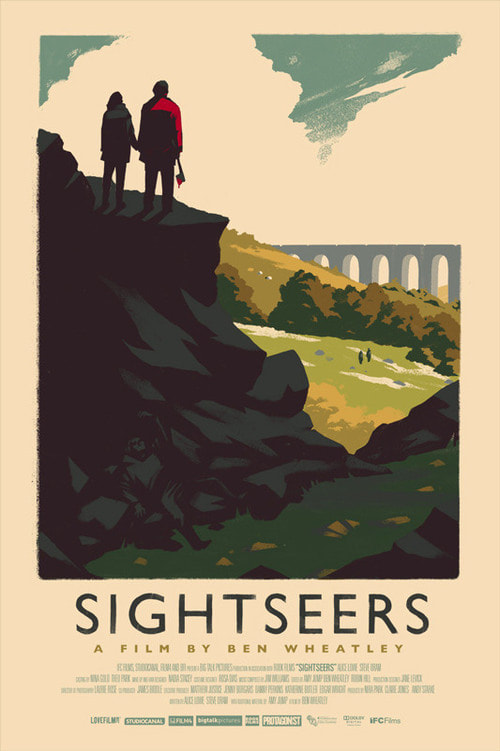
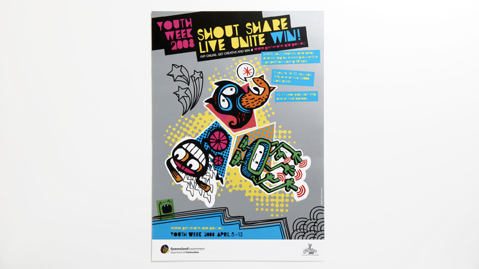
Re-Branding Me1/11/2019 When entering this trimester, I noticed that there was a self-branding module. As I already have self-branding, Brady Larson Art, this seems like a difficult task as I am married to my pre-existing design and brand identity. In order to progress through, I have conducted research to widen my scopes in attempt to distance myself from the pre-existing design for assessment purposes... One designer that has been an inspiration of mine for a while now, is Olly Moss. His branding is just his name in a similar aesthetic to that of the Hollywood Hills sign. The simplicity is the foundation to my online persona and will be consistent with the re-design also. Unfortunately, his social media presence is lackluster at the moment. His most recent post on Instagram was from May 2018. I will engage with my peers more often than he does. UPDATE: Just discovered that Moss was working with Valve on their latest VR game; Half Life: Alyx. I take back what I said about him not having time to engage with peers. Another illustrator that I discovered whilst researching was Sue Loveday, a Brisbane-based Illustrator. I dove deep into her work, all the way back to 2008 and discovered some of her artwork for the Youth Week Campaign. She created illustrative symbols used in the youth week campaign which depicted the theme 'shout share live unite". Her online brand and style is quite simplistic and matches the celebration of artwork that flows through me also. However, I would like to brand myself a little bit differently. I like her art and brand styles, but I would like to aim a little more professional, rather than personal. References
Moss, O. (2019). Sightseers [Image]. Retrieved from http://ollymoss.com/#/sightseers/ Moss, O. (2019). Olly Moss Logo [Image]. Retrieved from http://ollymoss.com/ Olly Moss: In case anyone was wondering if I was working on Half-Life: Alyx. ENHANCE. (2019). Retrieved 1 November 2019, from https://twitter.com/ollymoss/status/1197580346016980992 Loveday, S. (2008). Shout Share Live Unite [Image]. Retrieved from https://sueloveday.com/#illustration Loveday, S. (2019). Sue Loveday Logo [Image]. Retrieved from https://sueloveday.com/assets/images/sue-loveday.png
Back to Blog
Slogan's Heroes28/10/2019 Slogans are an essential element of advertising. They are generally short and they convey the tone of the brand with ease. Memorability is a must, as you must be instantly recognizable by your slogan, and recall back to the brand, and vice versa. In terms of advertising, it is essential to captivate your audience quickly, especially in today's digital age. People need to see that you're the real deal instantly. If you don't, you've already lost a sale. After reading through B&T Magazine's 10 Best Ever Advertising Slogans article provided in our lecture, I took the information I learned further and took a look at some popular slogans and break them down. KFC: Finger Lickin' Good - this implies that the food that is available at KFC is so good, that you'll be licking your fingers well after it's finished. This is also a literal indicator that they provide fast-food that doesn't require cutlery to consume. Similar to their most recent slogan "Bucket." which is an on-the-nose play on the words "fuck it" when talking about what to have for dinner. Saying "fuck it" and ordering a bucket of greasy chicken has been a staple of many households and allows consumers to reach the connection on their own, based on their own past experiences. Skittles: Taste the Rainbow - this slogan uses reframing to communicate the idea of how a rainbow would taste. As we all know, you cannot reach the (very real) pot of gold at the end of a rainbow, so this slogan implies that this is the next best thing. It is also a literal meaning as the candies themselves are different colours, and each have a distinct flavour. Nike: Just Do It - this slogan allows all consumers to intemperate it in any way they deem feasible. For example, if you were contemplating skipping the gym, Nike will be staring at you from the cupboard. As soon as you see the logo, you will make the connection and you're being subconsciously told to "just do it" instead of being lazy. Rice Krispies: Snap! Crackle! Pop! - this slogan uses literal meaning as the snapping, crackling and the popping are the sounds that the cereal makes when you add milk. This slogan can also trigger a nostalgic nerve and cause you to hear the feint sounds of the snapping... the cracking... and the popping. After looking at all of these slogans, I have decided to move forward with the slogan that I thought of initially. As my company name is called The Arc... I would like to play on the biblical story about Noah's Ark without touching any religious aspects. All Aboard. References
10 Of Adland's Best-Ever Slogans - B&T. (2019). Retrieved 28 October 2019, from https://www.bandt.com.au/10-best-ever-advertising-slogans/ The Best Company Slogans of All Time!. (2019). Retrieved 28 October 2019, from https://www.qualitylogoproducts.com/promo-university/10-best-slogans-of-all-time.htm
Back to Blog
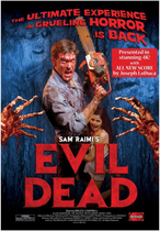
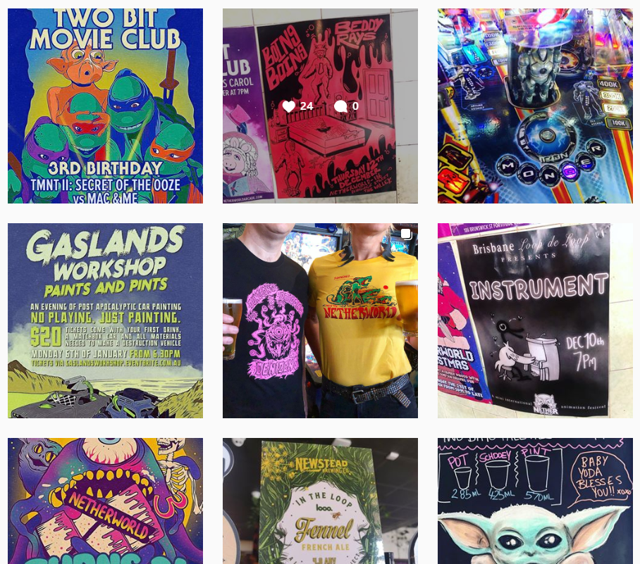
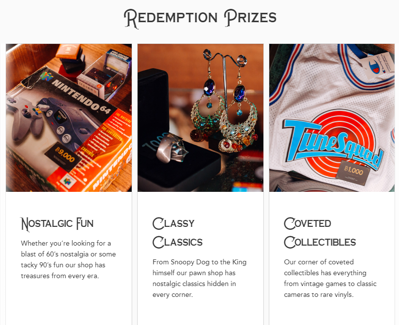
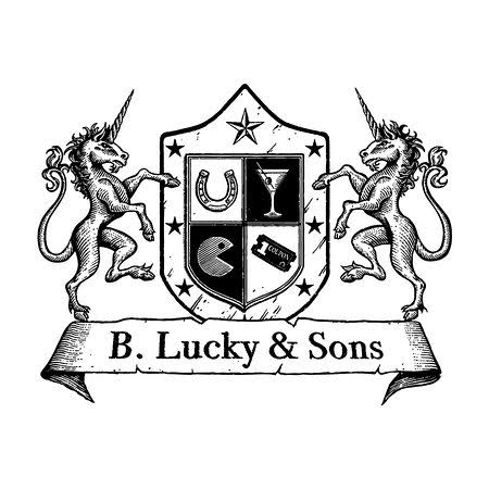
Deeper into The Valley...13/10/2019 In order to generate the best possible product, I have to take a closer look at my competition and see what they are doing in terms of advertising via social media and taking it one step further. Firstly I would like to take a closer look at the obvious competitor; Netherworld in Fortitude Valley. After I did preliminary research for my upcoming barcade, it was important to identify the local competition. Netherworld was an easy choice as I have visited that particular barcade a few times. However, they heavily rely on coin-based pinball machines and arcades from yesteryear. I would expand on this and include a variety of arcade machines from all eras of arcade gaming. Think Timezone, but with more socializing, and less Dance Dance Revolution. Upon researching into Netherworld, I discovered their consistent branding throughout. Their logo is a simple and effective typographical logo accompanied by a Luna Park-like identity graphic. Their branding is consistent throughout by using the same typeface which is also seen on the cover of Evil Dead (2009). Their social media presence is to be admired. They post socially two-three times a day, in efforts to engage with their audience. When diving deeper, I discovered that Netherworld produce their own collectible enamel pins, which is something that I would like to adapt, adding my own personal flare. They post competitions for customers to come in on a regular basis. This is considered to be a highly successful use of social media engagement - which will be inspired by in the weeks to come. Now, obviously Netherworld isn't my only competitor when it comes to barcades... B. Lucky & Sons Fortitude Valley is a partner of Holey Moley Golf Club, and Strike Bowling. Both of which are two pinnacles of the nightlife scene in the Valley and the surrounding Sunshine and Gold Coasts. However, B Lucky & Sons and Netherworld are both in the Valley which is why I chose to take The Arc over the river into South Bank. B Lucky & Sons positions itself as a luxury barcade that will have "you sorted for the perfect night out" (2019). They have advertised on their website that their prize pools have much more of an incentive as opposed to other arcades such as Timezone and Fun House. Nostalgic Fun, Classy Classics and Coveted Collectibles are the options that they advertise. Their logo is a vintage boarding school-like shield logo with a Horseshoe, Martini glass, Pac-Man, and an arcade ticket. All of which encompass a different element of the business. The Horseshoe symbolizes the luck-based arcade games at the venue. The Martini glass informs the consumers that alcohol is available to purchase - whilst being a little bit more classy about it. Pac-Man shows us that there are arcade games at this venue that can be played. And finally, the ticket stub guides us to believe that there are rewards for visiting or playing. Comparing the two locations, the social media presence is vastly different in terms of how often they advertise, and what they advertise. Netherworld posts multiple times a day. Whereas B. Lucky & Sons posts 2-3 times a week, max. Not only that, their advertising mainly consists of people, and the location more than what they have available to sell, like in Netherworld's case. That being said, both of these companies do a very good job at advertising to a particular crowd. Where we're aiming for with The Arc, is riiiiiight in the middle. An 80's barcade that rewards people returning via a leveling-up system. References
Netherworld Logo. (2019). [Image]. Retrieved from https://www.netherworldarcade.com/ Evil Dead Movie Poster. (2009). [Image]. Retrieved from https://www.bleedingcool.com/2019/08/27/evil-dead-returns-to-theaters-with-4k-remaster-and-new-score/ Netherworld Instagram Feed. (2019). [Image]. Retrieved from https://www.instagram.com/netherworldarcade/ B. Lucky & Sons Logo. (2019). [Image]. Retrieved from https://www.tripadvisor.com.au/Attraction_Review-g255100-d15643548-Reviews-B_Lucky_Sons_Melbourne_Central-Melbourne_Victoria.html#photos;aggregationId=&albumid=101&filter=7&ff=404066463 B. Lucky & Sons Instagram Feed. (2019). [Image]. Retrieved from https://www.instagram.com/bluckyandsons/ |
 RSS Feed
