AuthorWrite something about yourself. No need to be fancy, just an overview. Archives
December 2019
Categories |
Back to Blog
The Arc Walkthrough Feedback19/11/2019 Today’s walkthrough feedback session was incredibly productive. I wanted genuine feedback, so I opted to not be in the room as people were commenting. I feel that feedback is often restricted when the contributing party is in the same vicinity. "Can you tell that THE ARC is a bar/arcade?" Feedback for my logo:
This is the sort of constructive feedback I was after. I received similar results during the early process of ideation when initially pitching the idea earlier this trimester. Feedback for my poster:
The door is glowing, the print and the screen presented on did not show it up properly. I will change this accordingly. The poster is a play on Noah’s Ark. Coming far and wide to board this new vessel. I will test the poster with the original neon logo. I chose to use the white variation of this logo to not take away from the action of the poster. I will be adjusting the glow of the arc in the background to the golden yellows and browns from the sun to make it more cohesive. I might even add the lens flares behind to give a more dynamic feel. I will adjust the position of the logo and the boarding now. Again, the print and the screen used hasn’t shown all of the design elements that were added. There are neon mountains in the background and stars in the background too. I will adjust the lighting to show more. I will also be adding an address / location to the bottom of the poster. Just settling on a firm location. Feedback for my VIP Cards:
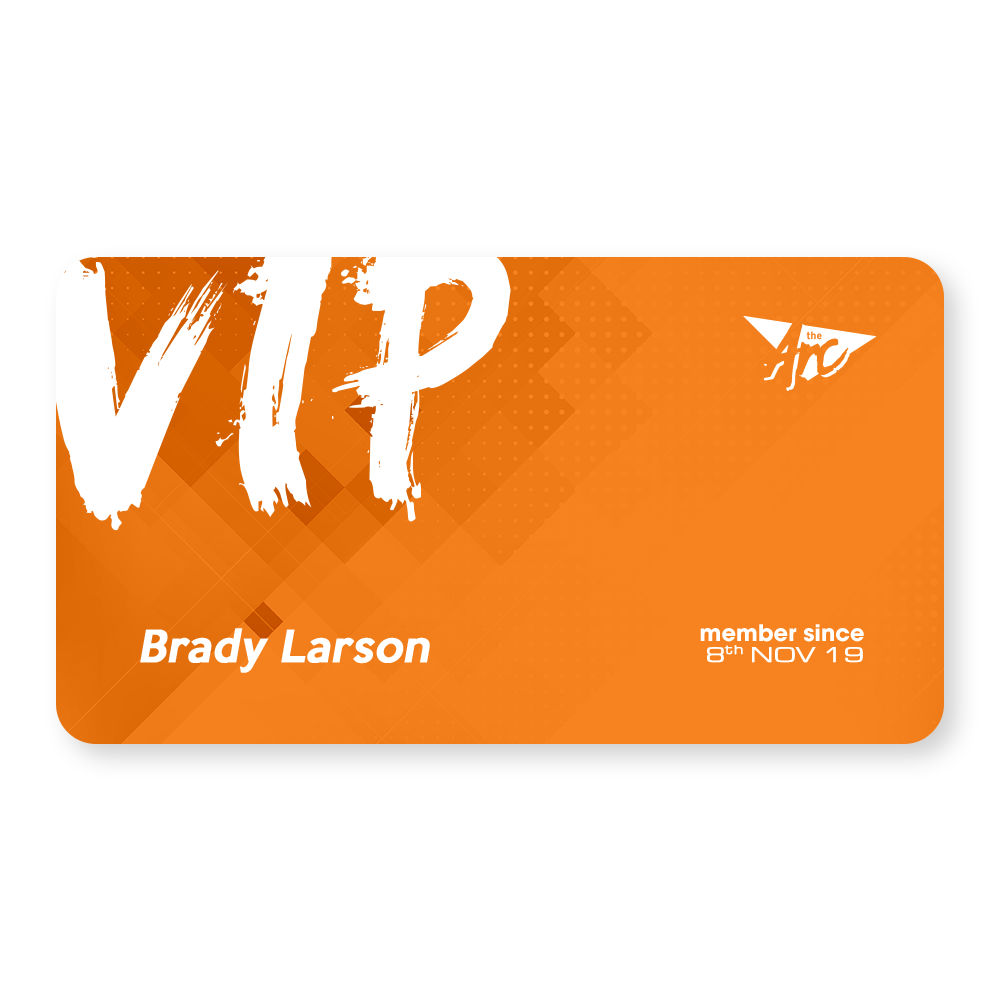
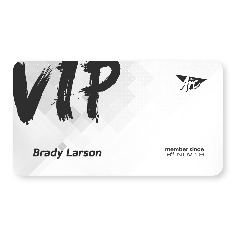
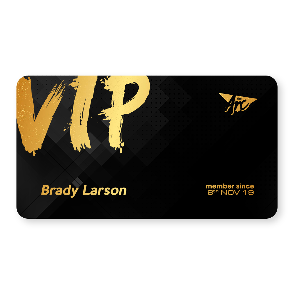
I agree with the comments about the typeface used for the VIP. While it matches the 80’s aesthetics in other elements, it is out of place in this instance and will be adjusted accordingly. I will make the card designs more cohesive in terms of background design. They’re divorced from the poster and the rest of the aesthetic. They exist… but why? I will make the logo larger and work on the backs of the cards. Feedback for my self-branding glyph:
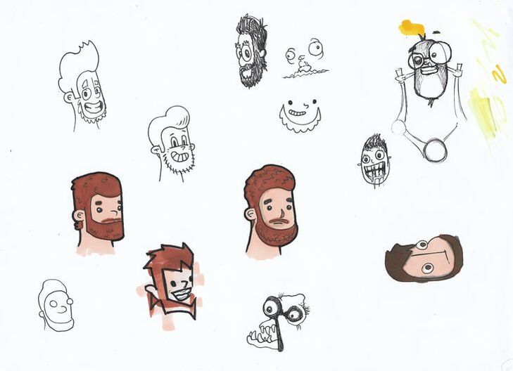
I was leaning towards the middle design as it matches the current glyph I currently promote myself with. Just a more updated version that screams me. The bean was a novelty and won’t be used for my branding. Feedback for my Collaboration:
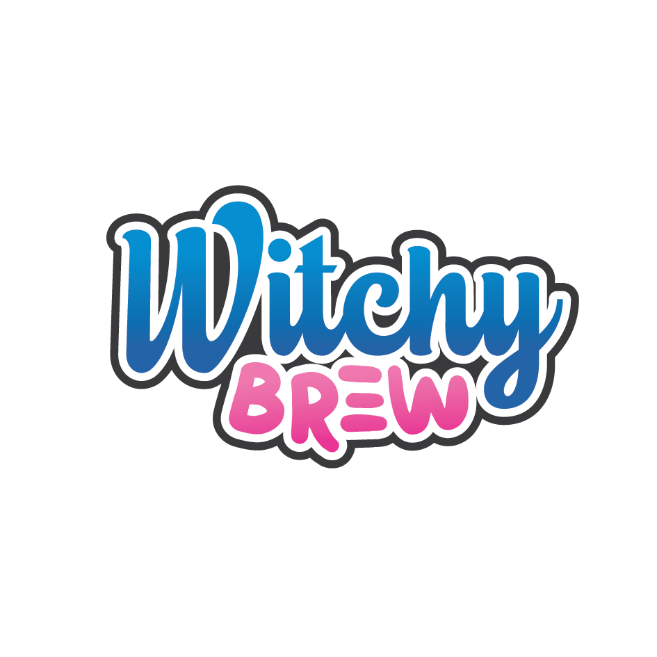
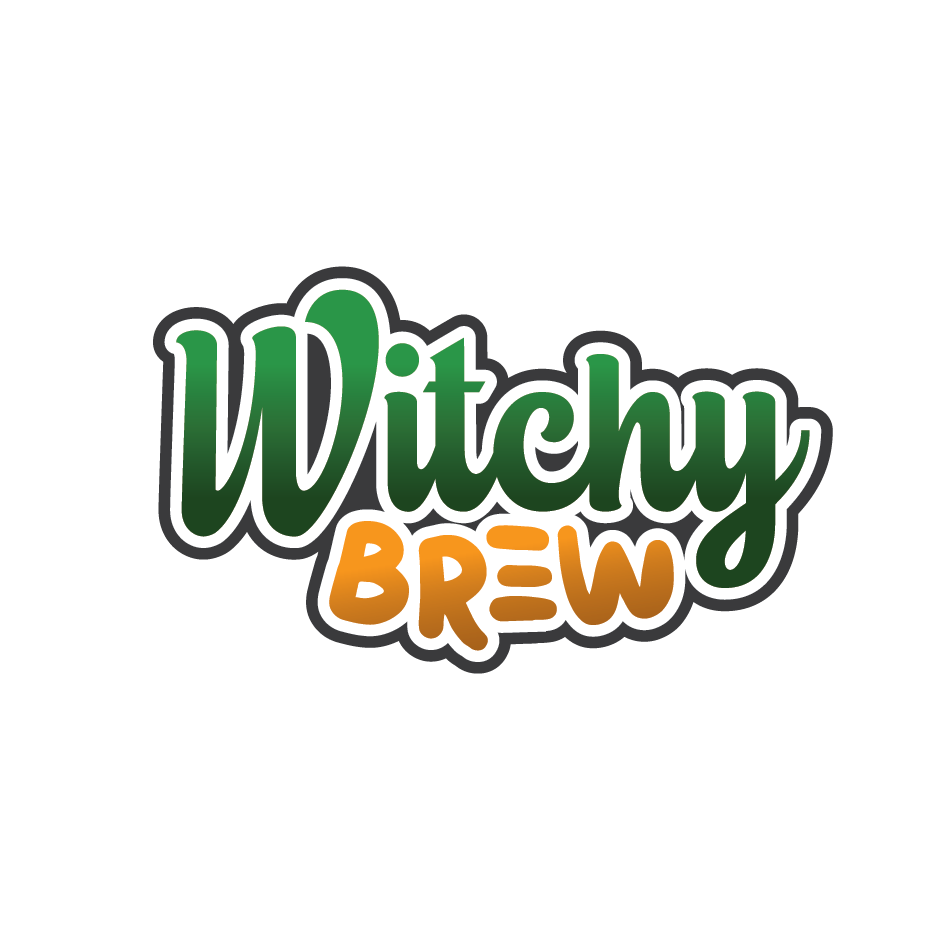
Cyprus (my client) agreed with a lot of the comments made and has chosen to go with option C as well. It matches the aesthetic of his game and designs.
I will be taking all of the information that people had provided today on board to enhance my designs accordingly. I do a lot of my ideation at university and then a majority of my work at home. I will continue when I get home.
0 Comments
Read More
Back to Blog
AGDA's Code of Ethics18/11/2019 The AGDA’s Code of Ethics is intended to provide protection for both designers and clients through what constitutes ‘fair play’. These codes outline the do’s and don’ts of taking on design jobs both within and out of Australia under a membership of the AGDA.
(Some codes have not been commented on by myself as I deem them common sense codes, such as the High Standards of design clause under section 2.4 of the Member’s Responsibilities to the Community) Some of these codes discourage working with clients that may be deemed as a personal conflict of interest such as a family member, friends, or their businesses. This can be quite difficult to do as a young designer as in some cases, it is who you know, not what you know. That being said, personal conflicts can expect a better quality of work, done quickly, and/or done for a fraction of the cost due to “mates rates”. We are all trying to put food on our tables. Compromise on cost = compromise on self-worth. I have experienced situations similar to this, and have distanced myself from that client. Confidentiality is a strict standard and a Non-Disclosure Agreement should be put in place to ensure all clients information is withheld from the public records. If information about client’s organization and activities are leaked, they would be enforced. Other codes that young designers like myself have to be cautious of are predatory pricing, which can damage the economic viability of their business. Predatory pricing practices such as free pitching, loss leading and other pricing below break-even are to be avoided. Before taking on a series of clients, it is best that you inform your current and potential client about the catalogue of projects that you currently have underway. This gives all parties an understanding of what timeframe adjustments might occur from this additional workload. Not only that, it is also a matter of professional courtesy, and is encouraged to maintain a healthy, open relationship with your clients. Do not plagiarise. Do not denigrate or belittle the work or reputation of another designer. As a competitive as this industry is, just don’t do it. It costs nothing to not be an asshole. In order to secure commissions, it is essential to present a proposal which outlines an understanding of the brief, how the project will be undertaken, and a cost estimate. In addition to this, examples of work, qualifications and details of experience is also helpful. It is also essential to have a client approve your proposal in writing to validate the consensual agreement for work to commence. This would include a task breakdown, a more detailed costs breakdown (or an hourly fee to be calculated), the terms and conditions for the design work’s undertaking, completion, and payment, and the disclosures that are set out in the Code. Avoid free pitching. This predatory method of providing work in a competition-like fashion is used by clients in order to drive the price of a design down via free submissions. “Why should I pay $3,000 for this logo, when the work’s already done?” Unpaid competitive tendering… No thanks. If you are a member of the AGDA, design competitions must only be participated in IF the competition meets the AGDA guidelines. When working in a collaborative effort, all designers and consultants must be credited for the specific areas of authorship. Ownership cannot be claimed if the project has been altered substantially from which the work was completed. Overall, these codes are considered to be common sense to me. However, this may be because of my feet already being in the water as a freelance designer. Over the years I have taken a step back and only taken on regular returning clients work as I am also working as a Sign writer in Archerfield and the only time left to do design work is incredibly limited whilst studying full-time. Over the Christmas break, I will promote myself more and make myself available for more clients whilst altering my pre-existing costs estimates and proposals.
Back to Blog
Sustainable Packages11/11/2019 By reviewing the Australian Packaging Covenant Organisation's Sustainable Package Guidelines of 2019, we as a class were able to analyse and identify key factors when it comes to creating environmentally conscious packaging.
Jacob and I were asked to research the effective ways that we could reduce wastage by designing for Transport, Reuse, and Recovery. Design for Transport Design packaging that should maximise the efficiency of transport, by utilising shipping space by ‘cubing out’ where appropriate. More efficient distribution packaging can reduce the use of energy, water, material and cost savings. Design for Reuse Reusable packaging, including distribution packaging, should be designed to be practical and environmentally beneficial. Reusing packaging increases the materials useful life, greater return from energy, materials and water used to manufacture. It reduces the need to recover or dispose of single-use packaging. Design for Recovery Design to maximize recovery and recycling at end-of-life by using materials sourced from recyclable products. Avoid materials that may contaminate the recycling process, informing consumers about appropriate disposal. Lower environmental impact and increase cost-effectiveness as opposed to virgin materials. After we looked at the APCO's documentation, we took a closer look at the Renourish website in regards to maintaining a higher level of recyclable product without compromising on quality. Everyone was given a different section to research, and we were directed to investigate Sourcing the Materials for in-depth systems thinking in regards to design strategies. Tier One Major material component of the material must be compostable, biodegradable, agricultural residues such as wheat straw, corn stover, hemp, kenaf, begasse, prairie grasses, etc. Industrial materials such as steel, aluminium and tin can be used for re-manufacture and are safer to use. Paper or materials manufactured by or with renewable energy are priority. Tier Two Components must be 100% PCW material for non-food packaging. Food packaging MUST use 10% PCW of the primary, and 100% for secondary. Again, industry materials can be used for a safer re-manufacture. Source materials to be regional to the vendors. Paper or materials manufactured by renewable energy credits. Tier Three Major material MUST be 30% PCW (for food, this applies to secondary packaging). Downcyclable materials used. If plastic is used then it MUST be BPA and phthalate free. After conducting this research, I have enough information to pursue a more eco-friendly packaging for both my Creative Advertising, and my Self-Branding assessments.
Back to Blog
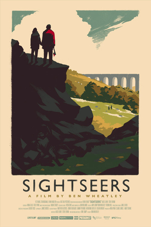
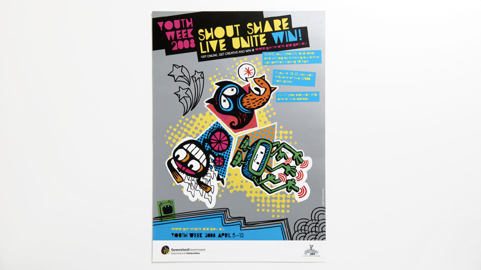
Re-Branding Me1/11/2019 When entering this trimester, I noticed that there was a self-branding module. As I already have self-branding, Brady Larson Art, this seems like a difficult task as I am married to my pre-existing design and brand identity. In order to progress through, I have conducted research to widen my scopes in attempt to distance myself from the pre-existing design for assessment purposes... One designer that has been an inspiration of mine for a while now, is Olly Moss. His branding is just his name in a similar aesthetic to that of the Hollywood Hills sign. The simplicity is the foundation to my online persona and will be consistent with the re-design also. Unfortunately, his social media presence is lackluster at the moment. His most recent post on Instagram was from May 2018. I will engage with my peers more often than he does. UPDATE: Just discovered that Moss was working with Valve on their latest VR game; Half Life: Alyx. I take back what I said about him not having time to engage with peers. Another illustrator that I discovered whilst researching was Sue Loveday, a Brisbane-based Illustrator. I dove deep into her work, all the way back to 2008 and discovered some of her artwork for the Youth Week Campaign. She created illustrative symbols used in the youth week campaign which depicted the theme 'shout share live unite". Her online brand and style is quite simplistic and matches the celebration of artwork that flows through me also. However, I would like to brand myself a little bit differently. I like her art and brand styles, but I would like to aim a little more professional, rather than personal. References
Moss, O. (2019). Sightseers [Image]. Retrieved from http://ollymoss.com/#/sightseers/ Moss, O. (2019). Olly Moss Logo [Image]. Retrieved from http://ollymoss.com/ Olly Moss: In case anyone was wondering if I was working on Half-Life: Alyx. ENHANCE. (2019). Retrieved 1 November 2019, from https://twitter.com/ollymoss/status/1197580346016980992 Loveday, S. (2008). Shout Share Live Unite [Image]. Retrieved from https://sueloveday.com/#illustration Loveday, S. (2019). Sue Loveday Logo [Image]. Retrieved from https://sueloveday.com/assets/images/sue-loveday.png |
 RSS Feed
