AuthorWrite something about yourself. No need to be fancy, just an overview. Archives
December 2019
Categories |
Back to Blog
The Arc Walkthrough Feedback19/11/2019 Today’s walkthrough feedback session was incredibly productive. I wanted genuine feedback, so I opted to not be in the room as people were commenting. I feel that feedback is often restricted when the contributing party is in the same vicinity. "Can you tell that THE ARC is a bar/arcade?" 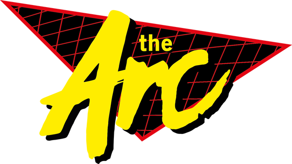 Feedback for my logo:
This is the sort of constructive feedback I was after. I received similar results during the early process of ideation when initially pitching the idea earlier this trimester. 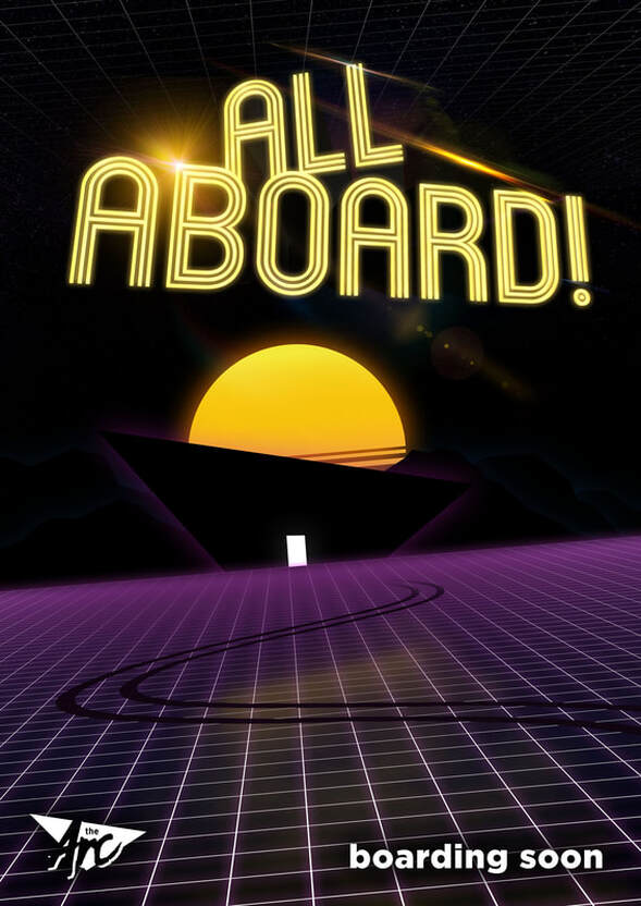 Feedback for my poster:
The door is glowing, the print and the screen presented on did not show it up properly. I will change this accordingly. The poster is a play on Noah’s Ark. Coming far and wide to board this new vessel. I will test the poster with the original neon logo. I chose to use the white variation of this logo to not take away from the action of the poster. I will be adjusting the glow of the arc in the background to the golden yellows and browns from the sun to make it more cohesive. I might even add the lens flares behind to give a more dynamic feel. I will adjust the position of the logo and the boarding now. Again, the print and the screen used hasn’t shown all of the design elements that were added. There are neon mountains in the background and stars in the background too. I will adjust the lighting to show more. I will also be adding an address / location to the bottom of the poster. Just settling on a firm location.
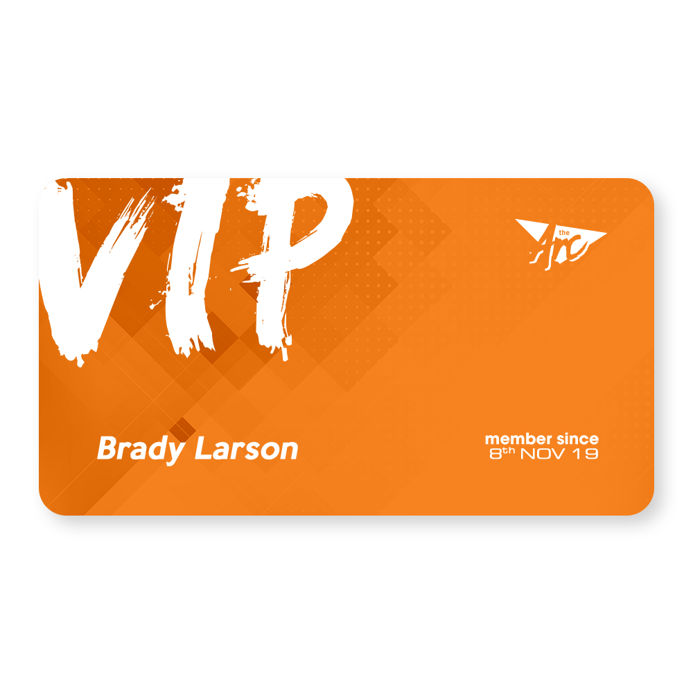
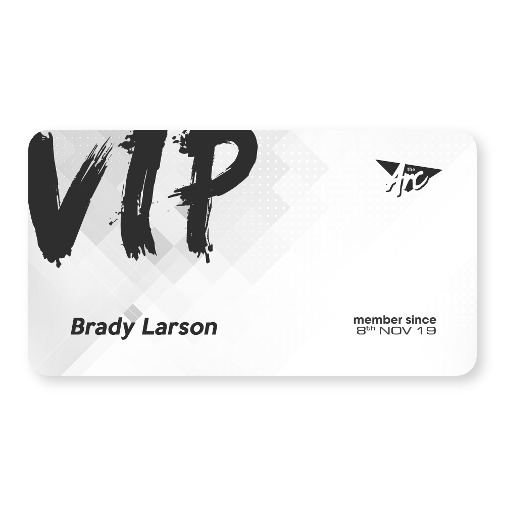
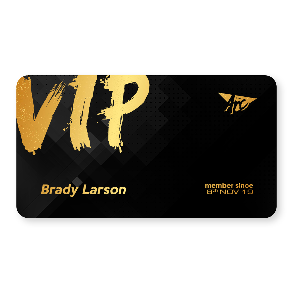
Feedback for my VIP Cards:
I agree with the comments about the typeface used for the VIP. While it matches the 80’s aesthetics in other elements, it is out of place in this instance and will be adjusted accordingly. I will make the card designs more cohesive in terms of background design. They’re divorced from the poster and the rest of the aesthetic. They exist… but why? I will make the logo larger and work on the backs of the cards.  Feedback for my self-branding glyph:
I was leaning towards the middle design as it matches the current glyph I currently promote myself with. Just a more updated version that screams me. The bean was a novelty and won’t be used for my branding.
Feedback for my Collaboration:
Cyprus (my client) agreed with a lot of the comments made and has chosen to go with option C as well. It matches the aesthetic of his game and designs.
I will be taking all of the information that people had provided today on board to enhance my designs accordingly. I do a lot of my ideation at university and then a majority of my work at home. I will continue when I get home.
0 Comments
Leave a Reply. |
 RSS Feed